Vimeo Events
Enabling flexibility for live streaming
Vimeo Events is a live streaming platform that enables broadcasters to produce and promote virtual events. From custom registration to post-engagement analytics, Vimeo Events enables any business to build an audience, prepare for an event in advance, and go live easily with a browser-based, studio-quality production tool.
Main accomplishments
Lead Product Designer of feature, end-to-end
Satisfied one of the top customer feature requests
High satisfaction score in testing (8.5/10)
High confidence score in testing (8.2/10)
Project summary
Timeline: 6 months
Deliverables: Competitive Analysis, Low / Medium / Hi Fidelity, Testing, Implementation
Tools: Figma
Target Device: Web (Desktop)
What is Vimeo Events?
Vimeo Events is a live streaming platform that enables broadcasters to produce and promote virtual events. From custom registration to post-engagement analytics, Vimeo Events enables any business to build an audience, prepare for an event in advance, and go live easily with a browser-based, studio-quality production tool.

Me, introducing first time users to Vimeo Events via an interactive tutorial I created using the product.
Prepare for an event
Broadcasters can build each scene ahead of time, including pre-recorded videos, guest speakers, graphics, and interactive moments. This ensures that their event runs smoothly.
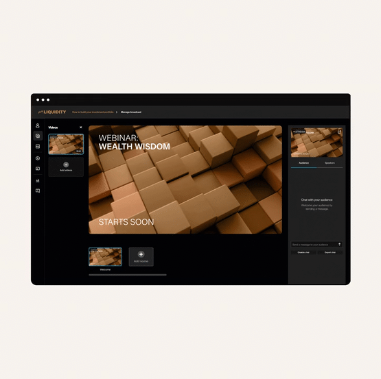
An example of building an event before the event goes live. A user in Vimeo Events adds multiple scenes to a Wealth Wisdom webinar.
Go live to an audience
Broadcasters can go live to an audience with real-time interaction, high-quality streaming, and the ability to send any piece of content to the stream at any time.

An example of a Vimeo Events user going live with a Wealth Wisdom webinar and chatting with that audience.
Interact with participants
When live, a broadcaster can interact with their audience using moderated chat, polls, and Q&A. These tools can be set up before an event or added on the fly.

An example of a Vimeo Events user live in a webinar using our polls feature. The audience votes on four options, and the user displays the results to the audience when the poll closes.
Who uses Vimeo Events?
Part of our role as designers is to consider the user’s perspective. When empathizing with our users, we try to understand where they are coming from so that we can design with them in mind. When researching this feature, one user said something that really stood out in my mind:
“Streaming is always a relatively stressful thing on the day of. And it causes no small amount of problems and pain in my life.
So if streaming were to work great, out of the box, that would be a really important deal.
It’s the live show.”
Live streaming is hard. You only get one shot at a live audience — there are no retakes or doing things over. As a result, our users can get really stressed out preparing for a live event. They need to make sure everything’s set up and working, ready to go, before that event takes place.
If there’s anything we can do to support this user need — to remove the stress of going and being live to an audience — it’s our job as designers to put that into the product.
Who are some of our top customers?
While we had many different customers interested in our product, we saw the most usage across four groups:
Marketers
As a live streaming, event based platform, marketers of all kinds were very interested in our product.
Fitness Studios
To enable virtual fitness classes, various fitness studios wanted to use Vimeo Events.
Faith Organizations
From sermons to funerals, people would use Vimeo Events as a gathering place of worship, reflection, and remembrance.
Educational Institutions
Educators used Vimeo Events to teach course and give lectures on a wide range of topics.
What’s the problem?
How does content fit into an event?
For this project, my task was to add new functionality to our Vimeo Events platform — the ability for a broadcaster to customize the layout of content in their events.
The problem to solve was to enable broadcasters to adjust the layout of content in their streams. Our customers had told us that they wanted the ability to lay out their screen in the way they wanted to, depending on their content.
At the time, our product was very prescriptive about what content could be seen and heard in the same scene. We heard feedback that broadcasters wanted more creative freedom to wow their viewers.
Let’s say a customer had both a speaker and a presentation that they wanted to show in the same scene:

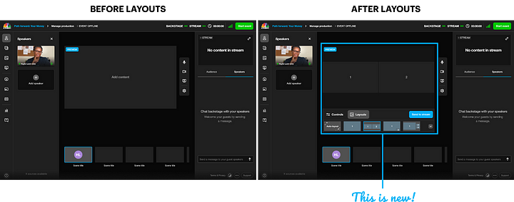
Before this feature, they could only do this in one way — a picture-in-picture format (PIP), which covered up parts of the presentation and made the speaker very small in the scene:

This format worked for our initial release, because the focus was on the content. Over time, however, we heard that customers wanted more flexibility to support multiple formats, like a speaker alongside a presentation, or a speaker and a presentation having the same visual weight on the screen.

Content determined layouts, not users
Depending on the content, we only allowed specific layouts:
Our goal - content flexibility via layouts
To address the issues of placing content in a scene, we envisioned a feature for Vimeo Events that would give our users the ability to lay out a scene with more flexible and customizable options.
Decouple content from layouts. Give broadcasters the flexibility to put their content wherever they wanted on the screen.
Determine which layouts to offer. Figure out how broadcasters want to lay out the screen.
Determine the UX/UI of those layouts. Figure out how the feature fits into the product ecosystem.
Our customers’ needs
Our customers had communicated a clear need to us — provide them the ability to change the layout of content in a scene. However, they didn’t say what specific layouts they were looking for. Additionally, they didn’t tell us how they wanted to use the feature. Would they prepare layouts in advance? Or would they adjust layouts on the fly, like they could with our interaction tools?
When defining the functionality of layouts, we came up with a few product tenets that helped guide the creation of the feature.
Balance creative freedom with ease of use
Vimeo Events should “just work” for our users. It needs to function easily, out of the box, with the non-savvy broadcaster in mind. There’s a balance we need to strike as a product between flexibility and ease of use. If we made layouts too flexible, we’d lose the ability to pick up and learn the product more easily.
Accommodate multiple paths
We didn’t want to restrict our users and force them down a specific path when building their events. We wanted to enable people to build their event in their preferred way, by giving them the ability to add content first, or choose the layout first, or even alternate back and forth as they build a scene or their event.
Additionally, we wanted to support multiple ways to add content to a layout, such as dragging and dropping content around the scene and swapping content in and out of a scene. This would enable people to build their event in the ways that felt most comfortable to them.
Enable creativity and customization
Vimeo Events should empower broadcasters to express themselves and be creative. As a result, this feature should enhance the ability for people to display their content in the ways they want to.
By introducing layouts, we hoped to enable broadcasters to customize the content in their scenes and create dazzling, stunning livestreams for their audience.
Single-screen
Our single-screen format worked for anything — speakers, images, videos, presentations, or screen sharing.
Picture-in-picture
When a speaker would combine with content, we would require both to be present at the same time.
Grid
We had a grid layout as well, but only for speakers. We had no way of putting multiple types of content into a grid.
Exploring what good looks like
What did others offer?
The virtual events marketplace is extremely competitive, with dozens of alternative products offering their interpretations on how to solve the problem of event customization. Several of these products offered scene layout options for their customers.
What layouts should we consider?
Outside of talking to our users and asking them their preferences (which I did later during testing), I wanted to see what other layouts existed, to understand expectations in other products.
Some products were quite robust, which conflicted with our product tenet of being simple. We felt that we could start our feature release with fewer layouts and see if customers needed more customization after launching the feature.

What customization should we offer?
We suspected some users want complete flexibility to adjust their layout, and some of our competitors came to the same conclusion. We needed to balance the tension of giving broadcasters more control while making sure our product is still intuitive and easy to pick up and learn, such as with drag-and-drop capabilities. Along similar lines, providing layout templates would enable our users to focus on the content, not the layout. We weren’t sure what the best approach would be, but we felt that for the first iteration of this feature, we could release something simpler and adjust it in the future if needed.

Where should layouts live?
I examined competitors as I considered the optimal place to assign a layout in our UI. Did we want to associate it with our content or with the scene the broadcaster was preparing? Some competitors had layouts already, which informed us of some possibilities.
In our initial thinking, placing the scene’s layout customization near the scene itself felt the most natural — it developed a relationship between the current scene and the layout of that scene.
Visualizing layouts
After our product research and ideation was set, I started to bring the feature to life in our product.
Exploring imagery and thumbnails
I started off abstract, imagining what an icon would look like with a person in the same scene. I realized this was too prescriptive and led the user to think that a person had to be present within that scene.
I then moved on to something more direct, using numbers to indicate the position in a scene. This made more sense for our product direction, which would offer users the flexibility to put whatever content they wanted into specific spots in a scene.

Still, there were problems. I realized my thumbnails didn’t take into consideration aspect ratios of the underlying content. To keep our product simple, we decided to restrict ourselves to a single aspect ratio and to build layouts under that constraint to avoid issues with cropping or displaying content in a partial screen format.
Choosing the layout options
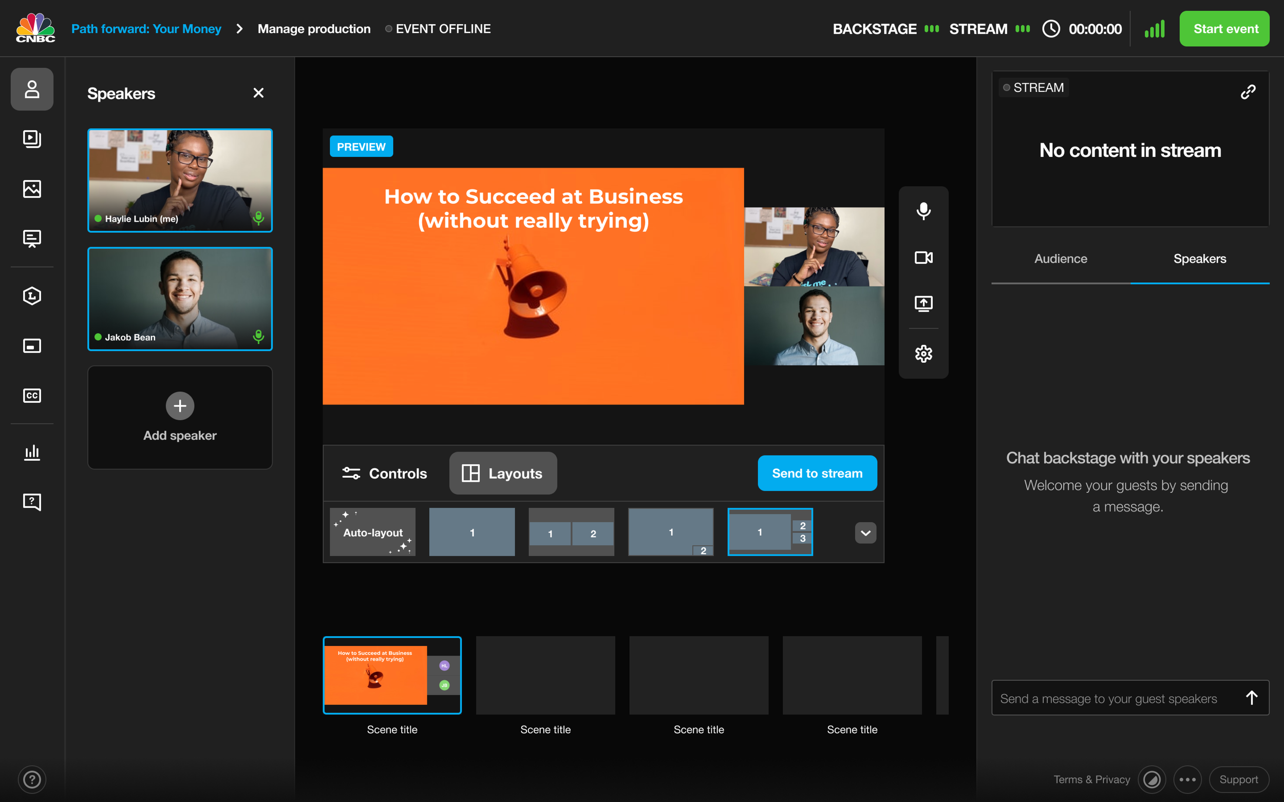
We decided to focus on a set of layout types in order to build heuristics and expectations for our users:
Single. Display any content, with or without a border.
PIP. Display a main piece of content, with the presence of a single speaker at a time.
Grid. Display multiple pieces of content, all with equal visual weight in a scene.
Spotlight. Display a main piece of content with multiple speakers present, all with equal secondary visual weight in a scene.
After speaking to our users, we felt these types would accommodate the most common use cases for layouts, such as a speaker alongside a presentation, or an expert interview panel, with one main speaker and several supporting ones.
However, to make the process of building a scene easier for our users, we also included an auto option that would enable them to add content to a scene and for our product to recommend the best layout for that content. This way, our broadcasters could focus on the content itself rather than worry about the position of the content on the screen.

Placing layouts in the product
Once we determined the layout options and thumbnails, we moved on to think about how it fit into the product. I mocked up several places for layouts to live in the UI — from including them with the content itself to including them with the scene in some capacity.

In the end, we felt that the layout of a scene should be closely tied with the specific scene itself, which led us to put the layout controls directly beneath the scene.
Testing our ideas
Multiple flows to build an event
With completed designs, we were ready to begin testing our ideas with actual customers of Vimeo Events. I prepared two flows for us to explore.
Flow 1 - Choose content, rely on autolayout

The first flow made the assumption that people would select a layout after the content was added to a scene. This meant that users would rely on auto layout and make adjustments as needed.
Flow 2 - Choose layout, then add content after

The second flow made the assumption that people would want the layout for their scene set up first, and then they would start adding content from there. Users would select a layout and then add content to places in the layout.
7 users
Zoom, moderated
30-45 minutes each
Testing with real customers
We recruited seven current customers to test both flows and recorded some high-level results from that testing.
People preferred selecting the layout first
Overall, people normally added a layout to a scene before adding content to it. The mental model was that they wanted their scene set up, and then they wanted to start going through that scene, adding the content they needed to, scene by scene.
“I can set this up, add my stuff, save this as a scene, and then I can go through and set up all my templates that way. That’s even better.”
The empty state text label implied an action
In our prototype, we had each spot in a layout say Add content, implying that a user could drag and drop content to that spot. However, users didn’t see it that way and instead tried to click that text for a menu to appear. That wasn’t our intention, and we wanted to make things less complicated, so we decided to revisit that functionality on our product’s actual release.
“If I click and add content, it doesn’t prompt me, so how do I add content? There isn’t anything that prompts me where to get the content from.”
"It would be cool if I could click "add content" on the placeholder and add some stuff right to the scene there."
Overall, people understood (and loved) layouts
Despite a few issues, for the most part, people really understood layouts. They gave us high satisfaction and confidence scores, which helped us feel confident in moving forward with the feature.
“I like that it is numbered, so you can see not just the layouts but where the main screen would be and you don't have to guess.”
“It's clear these are different ways to split the screen depending on how I want to update the scene based on content.”
Delivering designs
Where did we end up?
Before layouts, people had limited ways of controlling the content in their scenes. It was harder for our product to “just work” for our customers, and to enable them to create the amazing, stunning events that they envisioned when they came to Vimeo Events.
Layouts are less restricted
Layouts enable broadcasters to combine content into a scene however they wish. It could be a spotlight format, with a main piece of content and supporting content, like slides and two speakers. It could be a grid format, where each piece of content has equal weight. Or it could be a picture-in-picture format, where the speakers swap in and out depending on who’s talking. Allowing for this customization gives broadcasters the tools they need to create the events they want.

Layouts enable creativity
Because layouts exist and support any media type the product supports, broadcasters are able to get really creative. At times, I would try to push the limits of the product, creating mock scenes where I can live stream with interesting scene setups, such as an emoji picker, a scene where I’m being chased by a T-Rex, and a scene where I mimic the expression of a sea otter.

Most importantly, layouts are simple
This is the big one for us. Our goal when launching features inside of Vimeo Events is to make the product simple for our users. Broadcasters should be able to open up their browser, go to Vimeo Events, and make an event easily, without us getting in the way of what they want to create.
Our users said it best during testing:
“It’s so easy to practice with. It’s really simply laid out. I see all the stuff that I need to see there.”
“I feel really good about this. This is a much better place to be in for me to practice getting stuff laid out and make it clean. This is a step up already in a huge way for Vimeo Events now.”
The final product
Take a look at Vimeo Events in action, with layouts added: