Play Along Video
Making TV into interactive experiences
My Role
Led creative vision of two seasons of content.
Provided direction for animators, visual designers, actors, audio engineers, developers, and QA.
Collaborated with usability experts to review and prioritize user testing results.
Project summary
Created 20+ episodes of Play Along Video.
Defined the UX of 400+ interactive elements.
Engagement increased from linear to interactive by 1000% (based on downloads of linear vs. downloads of Play Along Video).
What is Play Along Video?
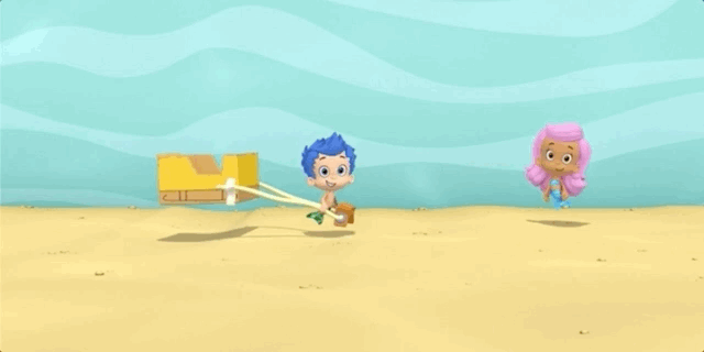
Play Along Video is Nickelodeon’s next entry into the smart device ecosystem. Leveraging its strong, well designed educational content, Nickelodeon created an interactive format for its linear television shows. With Play Along Video, children can interact with TV episodes by swiping, dragging, or tapping on the screen to Play Along with their favorite characters.
How was it created?
Play Along Video was made using a proprietary authoring tool built off of Unity. With that tool, we could simultaneously create interactive digital content alongside the production of linear TV content.
Product Strategy
What were our business goals?
As a business, we had several goals to accomplish for each episode and every interaction:
Increase surprise and delight

Treating interactions as moments of discovery, we included silly animations, Easter Eggs, and interactions with characters.
Turn watching into doing

By converting linear video into interactive experiences, we created a new form of entertainment that engaged learners.
Embed curricular moments

Working off the original storyline, we elevated preexisting educational moments by making them participatory instead of passively instructive.
Enhance educational value

We increased the amount of learning by designing new exercises not possible in linear video, such as tracing shapes and doing mathematic operations.
What did we want to accomplish?
We had several core philosophies we adhered to for each interaction we designed:
1) Did children learn something?

Our goal was to add to or enhance the curricular moments of an episode. Nickelodeon covers “hard” concepts, such as math or science, and “soft” concepts, such as socio-economics or kindness. If a child learned something new, like tracing the number 50 or the concept of a “neighborhood”, then we achieved our educational goals.
2) Did children feel like a part of the story?

One of Nickelodeon’s competitive advantages is its characters. In Play Along Video, we wanted users to feel like they were a part of the team. The more we could have children interact with the characters, the better – such as, by the characters addressing the children directly, or the children solving problems alongside the characters.
3) Did children have fun?
As a form of entertainment, we wanted children to have fun. The more children engaged with the episode and talked about it positively, the more we knew they were having a good time.
Crafting an Episode
How was an episode made?
Every episode of Play Along Video followed the same process.
Crafting the architecture of each interaction
Producers watched the original, linear episode and conceived over 20 points of interaction per episode. For each interaction, we thought of multiple ideas and explored their feasibility with representatives from brand, tech, animation, creative, and usability.

The team meeting to discuss an upcoming interaction.
We explored the skeleton of each episode, mapping out the logic in user flows, establishing interaction design through motion concepts, and writing initial copy to communicate directions to users. We then pitched our ideas to creative directors and stakeholders to establish buy-in.

Producers were responsible for clarifying complex user flows in clear, simple ways to communicate all possible scenarios to the team.
Writing microcopy and character dialogue
Outline established, Producers moved on to writing the dialogue for each interaction. Focusing on calls-to-action and clear communication, we wrote lines that directed users to complete tasks, stayed on brand, and added educational value. We then met with voice actors to coach their pitch, tone, and inflection for each line.

Dialogue can be tricky, and has to be very specific to meet usability guidelines for children. Here, the user is asked “to trace the dotted line with their finger”.
Leading interaction design through animation
A subtle head nod informs the user to “swipe right”.
Producers led the interaction design of each episode, providing animators with direction for each interactive element on the screen. Elements included animations that suggested the way a user should interact, such as a character nodding their head in a direction, or an object having an inner glow to draw the user’s eye and suggest it was interactive.
Animated idle states + informative copy teaches children to “drag up'“.
Deeply considering interaction design added an additional layer of communication with the user – we could rely on both audio and visuals to inform users how to interact. For a young audience, this was critical, as some children might not know words like “drag”, “swipe”, or “pull”. Children could learn new words while following the directions of the visuals to complete tasks.
Documenting specifications for the team
Producers detailed every interaction, providing animators, engineers, and QA the timing, triggers, and asset calls for each point of logic in an episode. From incorrect inputs, to success criteria, to branching narratives, Producers laid out the foundations for all possibilities of every touch point, visually and functionally.

Producers often sat with animators, engineers, and QA to go over the details of an interaction.
Reviewing the quality of each build
To ensure episodes met the guidelines set out in the specification documentation, Producers would test every permutation and provide feedback on tweaking values, fine tuning touch radii, and bugs encountered during play sessions.

Testing every iteration of an interaction can be time consuming, especially with timeouts, incorrect answers, and branching logic.
Defining usability testing criteria
As episodes were being built, Producers wrote usability guidelines for research specialists to test with children. We focused on ease of use, clarity of direction, dexterity, and how much fun users were having.
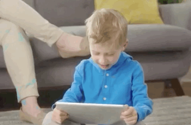
When the episodes were complete, Producers attended usability sessions as observers, taking notes as children tested each interaction.

Usability sessions focused on playability, clarity, and fun.
Launching the product
After usability testing each interaction and confirming that our designs were usable and accomplished our goals (which were learning, being a part of the story, and having fun), we continued to work with developers and QA to test across all supported devices, remove any bugs, and prepare the episodes for launch.
Eventually, we released the product to customers via Noggin, and we were featured in Times Square for the work that we’d done. It was amazing seeing the interactions I had worked on be shown to the world!